Safe Harvest Packaging

Overview

Safe Harvest needed a packaging and design system that made pesticide-free the hero of the shelf. The redesign built a cohesive brand architecture across SKUs and extended the visual identity into retail, digital, marketplace, and performance creatives.

For household shoppers, the health claim needed to be seen instantly. Reducing visual noise and front-loading pesticide-free created clearer shelf standout and stronger trust cues.
Our Role

  • Strategy
  • Conceptualization and scripting
  • Execution
  • Evaluation

Success

1Consistent premium identity established
4Formats shown across packaging assets
QRTrust signalling integrated into packs
GTMUnified retail, digital, marketplace, and performance system
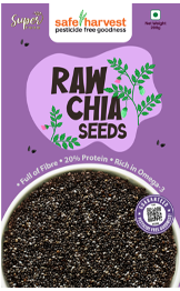
Safe Harvest redesigned packaging asset

Pesticide-free became the shelf hero.

The pack architecture made the core health claim more visible while standardizing the brand system across product formats.

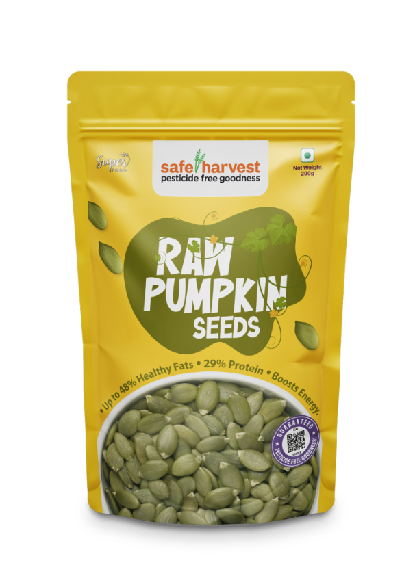
Safe Harvest packaging format asset

Multiple formats started speaking one brand language.

The redesign reduced noise and created a more consistent premium identity across categories including honey, spices, seeds, and snacks.

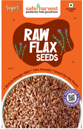
Safe Harvest packaging trust signal asset

Design made the proof easier to find.

QR-led trust signalling and clearer front-of-pack hierarchy helped the claim feel credible, not decorative.

Safe Harvest social post asset

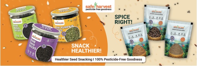
The visual identity travelled beyond the pack.

Retail, marketplace, digital, and performance creatives extended the packaging system into a unified go-to-market presence.

Safe Harvest digital creative asset

The redesigned world carried into platform assets.

Social and performance units kept the pesticide-free message consistent after the shopper left the shelf.

More Work